 SignageTube
When Should Screens Use Live Dashboards?
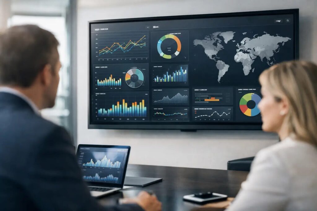
A production floor screen showing an hourly output total can change a supervisor’s next decision. A lobby screen showing the same number may confuse visitors. That difference is the real answer to when screens should use live dashboards: use them where an updated number helps someone act, prioritize, or understand what is happening now.
Live dashboards can make commercial screens more useful than static posters, but only when the data is relevant, readable, and dependable. Not every screen needs a constant data feed. In many cases, scheduled messages, promotions, announcements, and branded presentations do a better job. The goal is not to display more data. It is to put the right information in front of the right audience at the right moment.
When should screens use live dashboards?
Screens should use live dashboards when the information changes often enough that a scheduled update would be too slow, and when viewers can make a meaningful decision from it. Operational teams are the clearest example. A warehouse manager may need current shipping volume, delayed orders, or safety status. A customer service team may benefit from a live queue count and service-level performance. A hospital operations area may need bed availability, patient flow, or department status.
The best live dashboard screens answer a question viewers already have. Are we on target? Where is the bottleneck? Is there an exception that needs attention? How long is the wait? If the display cannot answer one of those questions quickly, live data may be adding noise rather than value.
A useful test is timing. If a report that is 30 minutes old could lead to the wrong response, automation is likely justified. If the information only changes daily or weekly, a scheduled slide or manually updated presentation may be simpler, easier to read, and more appropriate.
Use live data for action, not decoration
A dashboard belongs on a screen when it supports a specific operating rhythm. That could be a shift handoff, a daily sales huddle, a dispatch team monitoring deliveries, or a facilities team tracking open work orders. The screen becomes part of how the team runs the work, not just another display on the wall.
For example, a retail operations team might use a live dashboard in a back office to track current sales against the day’s target, inventory exceptions, and pickup order volume. A screen near the sales floor could instead show current promotions, product education, or a rotating brand message. Both screens are valuable, but they serve different audiences and require different content.
Customer-facing dashboard use also has a place. Airport-style queue updates, appointment wait times, event schedules, room availability, transit status, and order-ready boards can reduce uncertainty for visitors. In these cases, the data must be simple and immediately understandable. A visitor should not need to interpret a chart just to learn where to go next.
Situations where scheduled content works better
Live dashboards are not automatically better because they are current. A screen in a break room may be more effective with a clear mix of company announcements, recognition, benefits reminders, training notices, and safety messages. These communications need consistency and reach more than second-by-second updates.
Marketing displays also often benefit from scheduling rather than live data. Promotional campaigns need intentional timing, polished visual treatment, and controlled messaging. A restaurant menu may require real-time availability data during peak hours, but brand stories and featured offers can still rotate on a planned schedule.
Avoid live dashboards when the source data is inconsistent, poorly defined, or likely to create unnecessary concern. Displaying a metric with no context can damage trust. For instance, a daily performance target shown without accounting for staffing, equipment downtime, or seasonality may feel more like public pressure than useful communication.
There is also a practical viewing issue. Screens are usually seen at a distance and for a short time. A dense dashboard designed for a desktop monitor rarely translates well to a hallway display. If viewers must squint, wait for several screens to rotate, or decode tiny labels, the dashboard should be redesigned before it goes live.
Choose metrics that work at a glance
A screen dashboard should emphasize a small number of measures, usually one primary metric and a few supporting indicators. The amount depends on screen size, viewing distance, and audience familiarity, but clarity should always win over completeness.
Start with the outcome the audience can influence. A fulfillment team may focus on orders due today, on-time shipment rate, and exceptions requiring attention. A facilities team may focus on urgent tickets, response time, and rooms out of service. A leadership lobby display might show a high-level customer satisfaction result or progress toward a company-wide goal, provided the figures are appropriate for broad visibility.
Use visual signals carefully. Large numbers, plain-language labels, progress bars, and simple status colors are easier to interpret than complex tables. Color should support meaning, not carry it alone. Pair a red, yellow, or green indicator with text such as “Needs attention,” “Watch,” or “On target” so the message remains clear for every viewer.
Context matters as much as the number. A current total is more useful when viewers can see its target, trend, or expected range. “412 orders shipped” means little on its own. “412 of 450 orders shipped by 2 p.m.” makes the situation understandable. Keep that context concise enough to read in seconds.
Match the dashboard to the screen location
The same data should not necessarily appear in every location. Screen placement changes who sees the content, how long they have to absorb it, and whether sensitive information is acceptable.
A team-area screen can show operational detail that would not belong in a public corridor. An executive meeting room may need trend information and strategic milestones. A customer waiting area should focus on service updates, clear directions, and information that improves the visit. Department-specific screens are often more effective than a single dashboard sent everywhere.
This is also where governance matters. Decide who owns each metric, who can approve the display, and what should happen when a data connection fails. For employee-facing screens, confirm that individual performance, customer information, and other restricted data are not exposed. A live screen is highly visible by design, so its permissions and content rules should be equally deliberate.
Plan for reliability before going live
A dashboard is only helpful if people trust it. If a screen freezes, shows stale figures, or conflicts with the system employees use to do their work, viewers will stop relying on it. Treat data quality and playback reliability as part of the communication plan, not as an afterthought.
First, define the refresh rate that the use case actually needs. Some operational metrics need near-real-time updates. Others only need to refresh every 15 minutes, every hour, or at the end of each shift. More frequent refreshes can increase technical complexity without improving decisions.
Next, create a fallback state. If a live source is unavailable, the screen should not display a broken chart or blank page. It can switch to a clearly labeled last-updated view, a scheduled message, or a standard communication playlist. Viewers need to know whether the displayed status is current.
For organizations with data that must stay within their own environment, an on-premises approach may be the better fit. SignageTube Enterprise supports automated, real-time screen updates while allowing teams to align deployment with their IT and data requirements. For broader communications across distributed locations, cloud-based scheduling and remote management can be the more practical choice. Many organizations use both approaches across different screen types.
Build a screen-first workflow
The fastest path is usually to start with the question the screen must answer, then design the content around that answer. Do not begin by copying an existing business intelligence dashboard onto a television. Desktop dashboards are built for exploration. Digital signage is built for fast comprehension.
Create a screen-friendly layout using familiar tools and approved templates. Keep the main metric prominent, limit secondary details, and reserve space for alerts or short explanatory text. Review it from the expected viewing distance, not only on a laptop. If possible, test it with the people who will see it during a real shift or customer interaction.
Then establish a simple content calendar around the live view. A screen does not have to show a dashboard all day. It can alternate between live operational data, scheduled updates, safety reminders, recognition, and relevant announcements. This gives the dashboard attention without turning the display into a wall of numbers.
The strongest dashboard screens feel almost obvious to their audience. They show a current condition, make the next action easier to identify, and remain readable even during a busy day. Start with one screen, one audience, and one decision worth improving. When that screen earns trust, scaling the approach becomes much easier.
- SignageTube Starter – content signage on any TV
- SignageTube Enterprise – live data on your screens
- Digital signage software – how to choose, and what matters
- Templates – 120+ ready-made designs
- Pricing – simple per-screen plans