 SignageTube
OEE and Production Dashboards on the Plant Floor: The Data Model
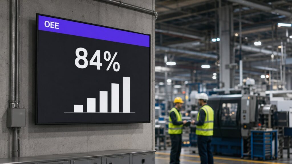
Plenty of vendors will sell you an OEE dashboard. Very few will tell you what data you actually need to feed one. This post covers the unglamorous part: the data model behind a plant floor OEE screen, and the display decisions that make it useful at six metres.
OEE in one paragraph
Overall Equipment Effectiveness is availability times performance times quality. Availability: how much of the planned time the machine actually ran. Performance: how fast it ran against its ideal cycle time. Quality: how much of what it made was good. Three ratios, multiplied, expressed as a percentage. An OEE of 84% means you got 84% of the theoretical maximum out of the machine.
The minimum data model
You need one record per machine per shift (or per hour, if you want finer trends). The columns:
| Column | Feeds | Typical source |
|---|---|---|
| machine_id, shift_date, shift | The grain | Planning system |
| planned_minutes | Availability | Schedule |
| downtime_minutes | Availability | Operator log or machine signal |
| ideal_cycle_seconds | Performance | Engineering standard |
| total_count | Performance | Counter or MES |
| good_count | Quality | Quality checks |
If you have those six facts, OEE is arithmetic. If you do not, no dashboard product can conjure it. Most plants start with the operator downtime log as the weakest link, and that is fine: a screen that shows imperfect numbers publicly has a way of improving the logging within a month.
Where the calculation lives
Keep the calculation in a database view or a maintained Excel workbook, not inside the display tool. The same logic then feeds the floor screens, the morning meeting and the monthly report, and nobody argues about whose number is right. The screen itself should read a finished result, in the same way we recommend for live SQL queries on factory screens.
Display rules for the floor
An OEE screen is read at a distance, in seconds, by people mid-task. That imposes rules:
One machine or line per screen region, one big number, colour used only for state (green on target, amber drifting, red stopped). Trends belong on a second slide in the rotation, not squeezed next to the live number. And the screen must say when the data is stale: a small “updated 09:41” line saves the credibility of the whole display the day a feed breaks.
Build the slides in PowerPoint with SignageTube Live and the numbers refresh themselves from your database or Excel model, on the hardware you already have. Our manufacturing page shows what other plants put next to OEE: safety days, shift schedules, andon-style status.
Ready to put a real number on the wall? Start a free trial.
- SignageTube Cloud – cloud-managed signage on any TV
- SignageTube Live – real-time data on your screens
- Digital signage software – how to choose, and what matters
- Templates – 120+ ready-made designs
- Pricing – simple per-screen plans