PowerPoint Signage vs Graphic Design Tools
A store manager needs a promo on screens before lunch. A school office has to update a parent notice across campus. A hospital team needs new wayfinding content without waiting on design resources. That is where the real difference in PowerPoint signage vs graphic design tools shows up – not in feature checklists, but in how fast a team can create, approve, and publish content that actually gets seen.
For most organizations, digital signage is an operational channel first. It supports promotions, internal communications, visitor information, safety messaging, and live updates across one screen or hundreds. The question is not which creative tool is more powerful in theory. It is which one helps your team keep screens current without adding friction.
PowerPoint signage vs graphic design tools: what are you really comparing?
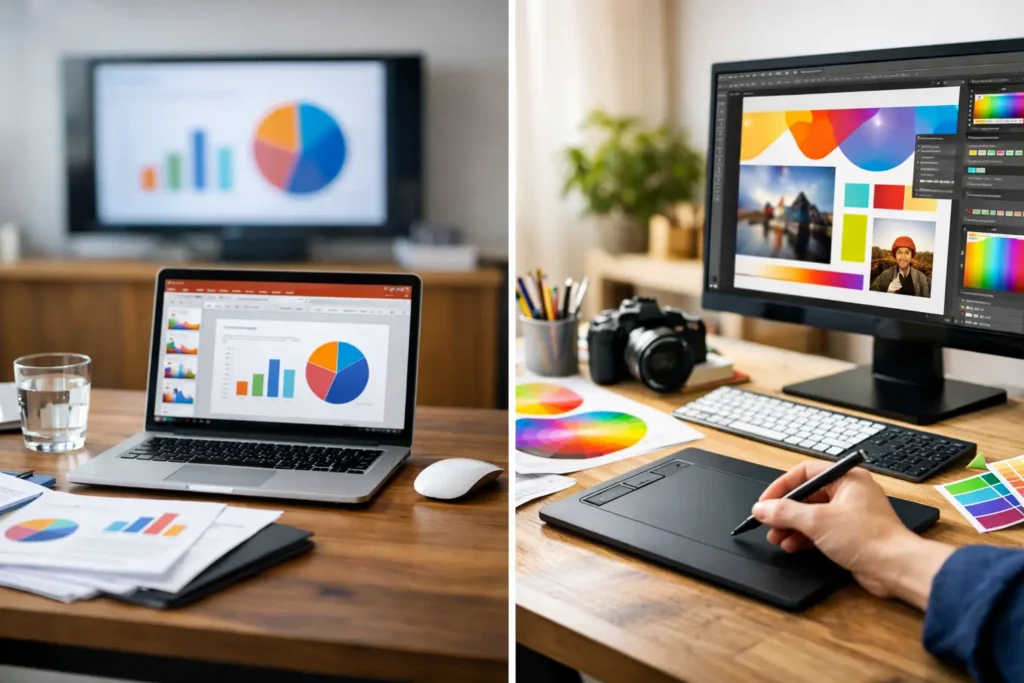
On paper, graphic design tools can look like the obvious choice. They offer more control over layout, typography, image editing, and visual detail. If your goal is to build a polished campaign asset from scratch, that can matter.
Digital signage has a different job. Screen content often needs to be updated by operations teams, office admins, marketers, HR staff, or site managers who are not full-time designers. They need content that is clear, on-brand, and ready quickly. In that context, PowerPoint has a practical advantage. It is familiar, widely available, and already part of many business workflows.
That changes the comparison. Instead of asking which tool can create the most advanced visual composition, it makes more sense to ask which tool fits the daily reality of signage management.
Why PowerPoint often fits business signage better
PowerPoint is not a specialized design platform, and that is exactly why it works for many signage programs. Teams already know how to open it, edit a slide, adjust text, swap an image, and save a file. There is very little training overhead.
That familiarity matters when content updates happen constantly. A promotion changes. A meeting room notice needs to rotate. A new safety reminder must appear on every employee screen by the afternoon. If each update requires a designer or a more complex creative workflow, screen content tends to lag behind the business.
With a PowerPoint-first signage workflow, everyday users can make those changes themselves. They can work from approved templates, keep brand elements consistent, and produce new screen content in minutes instead of waiting in a queue.
This is one of the biggest gaps in the PowerPoint signage vs graphic design tools discussion. Graphic design tools may produce highly refined assets, but they often create dependency on a smaller group of skilled users. PowerPoint spreads content creation across the people closest to the message.
Speed beats perfection on frequently updated screens
On digital screens, relevance usually matters more than pixel-level precision. A lunch special, event reminder, KPI slide, or campus alert does not need a complex design process. It needs to be readable, accurate, and live at the right time.
That does not mean design quality should be ignored. It means signage content should be designed for the pace of business. A strong template library inside a PowerPoint-based process gives teams structure without slowing them down.
Lower training burden means wider adoption
When a signage rollout depends on specialized software, adoption often narrows. Only a few people feel comfortable making updates, and everyone else submits requests. That creates delays and limits the value of the network.
PowerPoint reduces that barrier. Marketing can prepare seasonal slides, HR can update internal notices, school staff can revise announcements, and location managers can handle local promotions. IT still keeps governance over deployment and screen management, but content creation becomes much more accessible.
Where graphic design tools still make sense
There are situations where graphic design tools are the better fit. If a brand requires highly customized visual campaigns, advanced image manipulation, or detailed creative control, a dedicated design environment can be worth it. The same is true for flagship locations, major product launches, or premium brand experiences where every screen element is part of a broader visual production.
Graphic design tools also help when signage assets are being repurposed from larger campaign work already built by a design team. In that case, using the original source files can preserve creative fidelity.
Still, even here, there is an operational question to answer. Once the asset is designed, who updates it next week? Who changes dates, store names, room numbers, or compliance text? A beautiful screen that is hard to maintain can become stale surprisingly fast.
That is why many organizations benefit from a mixed model. Designers create standards, templates, and key campaign assets. Broader teams handle routine updates in PowerPoint. This keeps quality high without making every screen change dependent on creative specialists.
Content creation is only half the job
A signage program does not succeed because a slide looks good on a laptop. It succeeds when content reaches the right screens, on schedule, across locations, without manual work at each endpoint.
This is where the tool conversation should expand. PowerPoint and graphic design tools are content creation environments. They are not, by themselves, screen management systems. Organizations still need a way to publish, schedule, organize, and control playback across displays.
For example, a retail group may want a national promotion to run across all stores while allowing local managers to insert site-specific slides. A healthcare network may need different playlists for waiting rooms, staff areas, and wayfinding screens. A corporate office may want announcements scheduled by time of day and department.
Those needs are operational, not creative. They require centralized management, permissions, scheduling logic, and reliable playback.
Why workflow matters more than tool purity
Some teams focus too much on choosing the “best” design tool and not enough on the full publishing workflow. The better question is this: how easily can your team go from creating content to displaying it at scale?
If PowerPoint fits the users and the organization has a platform that can turn presentations into scheduled signage, the workflow is straightforward. Users build content in a familiar environment, upload it, assign it to screens or groups, and manage updates centrally. That is a much cleaner process than exporting files manually, moving them between systems, and relying on local intervention.
For organizations that need cloud-based control, remote management simplifies rollout across distributed locations. For environments that require on-premises deployment or real-time automated updates from internal systems, a local architecture may be the better fit. The point is not just what you design with. It is how the content moves from creation to playback with the fewest bottlenecks.
Choosing based on your team, not just the feature set
If your signage strategy depends on frequent updates by non-designers, PowerPoint is usually the stronger operational choice. It is faster to adopt, easier to delegate, and more sustainable across departments. That matters in schools, offices, clinics, hotels, and stores where communication changes daily.
If your screens are part of a high-design brand environment with lower update frequency and strong in-house creative support, graphic design tools may play a larger role. Even then, it is worth separating campaign design from day-to-day signage maintenance.
A practical way to decide is to look at three things: who creates the content, how often it changes, and how many screens it needs to reach. When content is created by everyday business users, changes often, and must scale across locations, PowerPoint becomes hard to beat.
That is also why platforms built around PowerPoint-based signage workflows can be so effective. They turn a common office tool into a structured communications process, with scheduling, remote control, template reuse, and deployment options that fit both cloud and on-premises requirements. For teams that want screens to work like a reliable business channel instead of a design project, that approach is simply more usable.
The real trade-off in PowerPoint signage vs graphic design tools
The trade-off is not creativity versus quality. It is control versus speed, specialization versus accessibility, and isolated asset creation versus ongoing screen operations.
Graphic design tools offer more visual precision. PowerPoint offers more organizational reach. One helps expert designers do more. The other helps more people get the job done.
For digital signage, that distinction matters. Screens only deliver value when content stays fresh, accurate, and easy to manage. If your team can update a message in minutes and publish it across the network without chasing design resources, your signage program is far more likely to stay active and useful.
The best choice is the one your team will actually use consistently – and the one that keeps your screens current when the business changes faster than the design cycle.