Learn how to display real‑time stock prices, production metrics, and other live data on your digital signage. Discover tools and workflows that turn dashboards, KPIs, and financial feeds into dynamic, always‑updated screen content for smarter decision‑making.
This guide is for business owners, IT managers, and communications professionals looking to leverage live data in their digital signage networks. Staying relevant and engaging in today’s fast-paced environment requires real-time information on your screens.
In the early days of digital signage, simply having a screen on the wall was enough to impress. It replaced the corkboard and the printed poster, offering a glowing, modern way to share information. But today, the novelty has worn off. We live in an era of instant gratification and constant connectivity. A screen displaying a static slide created three days ago is not just boring; it’s often irrelevant.
To truly engage an audience—whether they are traders on a financial floor, workers on a production line, or executives in a boardroom—content needs to be alive. It needs to reflect the reality of the present moment. Real-time data brings digital signage content to life, making it more engaging and impactful for viewers.
Moving beyond static slides to display live information like stock tickers or production metrics transforms your digital signage from a passive decoration into a critical business tool. Delivering real time content ensures your screens provide immediate, dynamic updates that keep your audience informed and engaged. This guide explores why real-time data is essential for modern business communication and provides actionable steps on how to integrate these live feeds into your displays.
Introduction to Digital Signage
Digital signage has revolutionized the way organizations communicate, moving far beyond the limitations of static posters. With modern digital signage software, businesses can transform their screens into dynamic, data-driven displays that capture attention and deliver real value. Digital signage solutions empower users to create engaging content that not only informs but also educates and entertains audiences across locations.
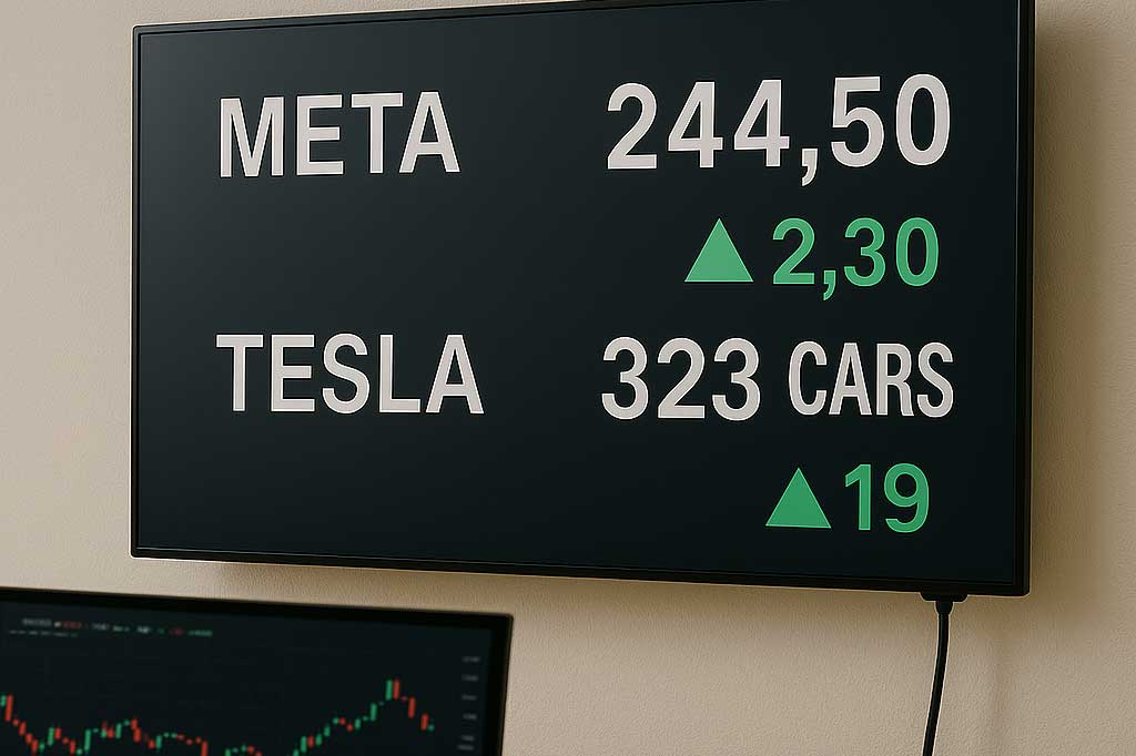
Live data for digital signage is any information that refreshes on a screen automatically when the source changes.
By leveraging digital signs to display key metrics, social media feeds, and other relevant data, organizations can keep their audience informed with accurate, up-to-date information. Connecting digital signage to external data sources ensures that content remains fresh and timely, supporting better decision making and operational efficiency. Whether it’s sharing live sales figures, broadcasting social media updates, or highlighting performance dashboards, digital signage enables businesses to deliver content that is always relevant and impactful.
The Problem with “Set It and Forget It”
Many organizations fall into the trap of “set it and forget it” digital signage. A marketing manager creates a slide deck at the beginning of the month, uploads it, and walks away. By the end of the first week, the content is stale. By the end of the month, it’s invisible.
Static content suffers from two major flaws:
-
Lack of Urgency: If the information doesn’t change, there is no reason for anyone to look at the screen more than once.
-
Delayed Decision Making: If a production line is falling behind target, seeing a report about it tomorrow is too late. The opportunity to correct the course has passed.
Real-time data solves both problems by ensuring timely information is always available for decision-making. It commands attention because the content is always new, and it empowers immediate action because the data is current.
Why Real-Time Data Drives Better Decisions
Integrating live metrics into your digital signage strategy does more than just look cool—it fundamentally changes how your teams operate. Displaying and visualizing key data on your screens ensures that decision-makers and audiences receive real-time insights that boost engagement and sales, driving better engagement and more informed, efficient decision-making.
1. Transparency and Accountability
When stock prices or sales figures are displayed publicly in real-time, there is nowhere to hide. This transparency fosters a culture of accountability. Sales teams can see exactly where they stand against their targets. If the numbers are low, the motivation to improve is immediate. If the numbers are high, the recognition is instant. Real-time displays make it easy for teams to visualize their progress toward goals, keeping everyone informed and engaged.
2. Rapid Response to Issues
In manufacturing and logistics, time is money. A production dashboard that updates every second allows managers to spot bottlenecks the moment they happen. Integrating business data—such as real-time inventory levels, sales figures, and operational metrics—into digital signage ensures managers have instant access to critical information for rapid decision-making. If a machine goes down or output drops below a certain threshold, the screen flashes red. This visual cue triggers an immediate response, minimizing downtime and saving costs.
3. Enhanced Engagement
For financial institutions or corporate lobbies, displaying live stock market feeds adds a layer of professional legitimacy and interest. It signals that your organization is connected to the pulse of the market. Visitors and employees alike naturally gravitate toward screens that offer valuable, up-to-the-minute information. Real-time digital signage also enables you to deliver personalized, engaging experiences for customers, ensuring they receive relevant content that enhances their interaction with your brand.
How to Integrate Live Data: From Simple to Advanced
The idea of connecting a database or a live financial feed to a TV screen can sound intimidating. You might imagine complex coding or expensive custom software. While those options exist, there are also surprisingly simple ways to get started.
Here are three common methods for displaying real-time data, ranging from beginner to advanced. When displaying data on digital signage, automatic updates from sources like dashboards, operational systems, or spreadsheets are essential to ensure the information shown is always current and reliable, especially when you are getting started with real-time digital signage.
Excel Link (The “Low-Code” Solution)
For most internal business metrics, the data already lives in a spreadsheet. Microsoft Excel is the engine room of the corporate world, and it is surprisingly easy to turn a spreadsheet into a live dashboard. Live dashboards enable real-time monitoring and visualization of business metrics, allowing organizations to display up-to-date KPIs and insights directly on their digital signage screens, as part of broader live data for digital signage with real-time updates and dashboards.
How it works:
-
Host the File: Save your Excel workbook on a cloud service like OneDrive, SharePoint, or Google Sheets. This ensures the file is accessible online.
-
Connect to Signage: Many modern digital signage platforms (like SignageTube) offer native integration with these cloud storage services.
-
Map the Data: You select the specific cell range or chart you want to display.
-
Automate: When you update the Excel file on your computer and save it, the cloud syncs the changes. The digital signage player detects the update and refreshes the screen content automatically.
Best Use Case: internal sales leaderboards, daily safety stats, or cafeteria menus.
API Integrations and Widgets
If you need external data—like stock prices, weather, or currency exchange rates—you don’t need to build the data yourself. Connecting to multiple live data sources is essential for powering real-time digital signage with automatic, up-to-date content and dynamic visualizations. You just need a way to fetch it. This is where APIs (Application Programming Interfaces) come in.
Most signage software comes with pre-built “widgets” or “apps” that handle the API connection for you.
How it works:
-
Select a Widget: In your signage dashboard, choose a “Financial” or “Stock” widget.
-
Configure: Enter the ticker symbols you want to track (e.g., AAPL, MSFT, GOOGL). You can usually customize the colors (green for up, red for down) and the display style (scrolling ticker vs. static cards).
-
Deploy: Add the widget to a zone on your screen (usually the bottom or side) so it plays alongside your other content.
Best Use Case: Financial news tickers in lobbies, currency rates in travel agencies, or weather updates in retail stores.
Direct Database Connection (SQL/JSON)
This is the “power user” level, often required for manufacturing floors or large logistics hubs where data is stored in proprietary databases like SQL, Oracle, or SAP. With this approach, you can visualize raw data directly from these databases, enabling real-time insights and up-to-date information on your digital signage screens, which is essential when implementing real-time information on your digital displays.
How it works:
-
Export Data: Your IT team sets up a query that exports key metrics to an accessible format, often a JSON or XML file hosted on a local server.
-
Read the Data: The digital signage software is configured to “read” this file at a set interval (e.g., every 5 seconds).
-
Visualize: You use the signage software’s design tools to map data points to visual elements. For example, if the “Units Produced” value in the data file is < 100, the background of the screen turns red. If it is > 100, it turns green.
Best Use Case: Live manufacturing production lines (OEE), call center waiting queues, or warehouse inventory tracking.
Managing Data Feeds
Effectively managing data feeds is essential for maximizing the impact of digital signage. With robust digital signage software, users can seamlessly integrate a variety of data sources—ranging from sales dashboards and social media to queuing systems—directly into their displays. This integration allows organizations to present complex data in a visually compelling way, using powerful visualizations such as charts, graphs, and images that showcase the benefits of real-time digital signage for your business.
Digital signage solutions make it easy to manage multiple data feeds, ensuring that the right information appears on screen at the right moment. By binding data fields to specific display elements, users can create dynamic content that updates automatically in real time, eliminating the need for manual updates. This approach not only streamlines content management but also ensures that dashboards, images, and other visual elements always reflect the latest data, keeping audiences engaged and informed while helping you master real-time content for dynamic digital signage displays.
Design Tips for Data-Driven Displays
Getting the data on the screen is only half the battle. You also need to make sure it’s readable. Designing an effective layout is crucial for communicating real-time data quickly and clearly to your audience. A spreadsheet with 50 rows and columns is impossible to read from ten feet away.
Focus on the “Big Number”
-
Focus on the “Big Number”: Identify the single most important metric (e.g., “Current Stock Price” or “Daily Output”) and make it huge.
Use Color for Context
-
Use Color for Context: Don’t just show a number; show what it means. Use green for good, red for bad, and yellow for caution. The brain processes color faster than text. Color and visual elements are key aspects of effective data visualization on digital signage, helping viewers instantly interpret information.
Keep it Simple
-
Keep it Simple: Remove gridlines, unnecessary axis labels, and small text. A digital sign is a billboard, not a document.
Add Context
-
Add Context: A number like “450” means nothing on its own. Label it clearly: “Units Produced Today (Goal: 500).”
Real time data visualization techniques can be used on digital signage screens to transform raw data into engaging charts, graphs, and dashboards, enhancing audience engagement and supporting better decision-making with up-to-the-minute insights.
Finally, remember that setting an appropriate refresh rate is essential to ensure your digital signage screens display the most current information without overwhelming viewers or causing distractions.
Real-World Examples
Across industries, digital signage powered by live data is delivering high-impact results.
Retail
In retail, for example, stores use digital signage to display real-time sales data, inventory levels, and customer traffic patterns. This enables managers to make quick decisions on pricing, promotions, and stock replenishment, directly improving performance and customer satisfaction.
Healthcare
In healthcare, hospitals leverage digital signage solutions to present live patient information, medical records, and test results, streamlining communication and reducing the risk of errors.
Education
Educational institutions use digital displays to share class schedules, event updates, and emergency alerts, ensuring students and staff always have access to the most current information.
These real world examples demonstrate how integrating live data into digital signage can create engaging, results-driven experiences that benefit both organizations and their audiences, underlining the broader benefits of real-time digital signage for your business.
Common Challenges
While digital signage offers tremendous benefits, organizations often face challenges in ensuring that displayed data is both accurate and current. Leveraging digital signage software that can connect to a wide range of data sources—including Power BI dashboards and queuing systems—helps maintain data integrity and relevance. Another common hurdle is crafting engaging content that resonates with viewers. By utilizing high-impact visualizations such as videos, images, and charts, businesses can create dynamic content that captures attention and communicates key messages effectively.
Integrating multiple data feeds may require some technical expertise, especially when dealing with complex data sources or custom dashboards. However, with the right digital signage solution, these challenges can be overcome, enabling organizations to connect to their data, automate updates, and deliver accurate, high-impact content that drives results.
Measuring Success
To ensure digital signage delivers ongoing value, it’s essential to measure its success using key metrics. Tracking engagement rates, customer satisfaction, and sales performance allows organizations to evaluate the effectiveness of their digital signage strategy. Modern digital signage solutions provide detailed analytics and insights into content performance, enabling businesses to refine their approach and maximize impact.
By leveraging data-driven insights, organizations can optimize their digital signage experience, ensuring that content remains relevant and engaging over time. With the right metrics and analytics in place, businesses can clearly demonstrate the ROI of their digital signage investment and make informed, data-driven decisions to continually improve their communication strategy.
Conclusion: Turn Your Screens into Assets
Moving beyond static slides is a pivotal moment for any digital signage network. It marks the transition from using screens as digital wallpaper to using them as strategic assets. Integrating live data brings more value to your digital signage network by maximizing the impact and utility of your displays.
By displaying real-time stock prices, production metrics, or sales figures, you connect your physical environment to your digital reality. Integrating with business intelligence platforms streamlines data access and visualization, making it easier to publish dashboards and reports directly to your screens. You empower your employees with the information they need to make faster, smarter decisions, and you engage your visitors with content that is always fresh and relevant. Start small with a simple Excel integration or a stock ticker widget, and watch how the energy in the room changes when the data goes live. Begin with one screen to pilot your setup before scaling to more displays or locations. Managing digital signage across each location becomes seamless with cloud-based control and real-time updates, reflecting the broader shift toward real-time digital signage content. Always ensure secure data transmission and access to protect sensitive information and maintain trust as you integrate live data into your digital signage.