Best Practices for Campus Display Content
A student has about six seconds to notice a screen in a student union before they keep walking. A faculty member glances up between meetings. A visitor is already looking for a building number, not a full paragraph. That is why the best practices for campus display content are not really about filling screens. They are about helping people get the right information at the right moment, in the right place.
On a campus, that sounds simple until it is not. Screens serve different audiences across admissions, student life, athletics, academic departments, libraries, dining, and facilities. Content needs to feel consistent, but not generic. It needs to be fast to produce, but still polished. And it needs to be manageable by teams that often do not have a designer or developer standing by.
What makes campus display content work
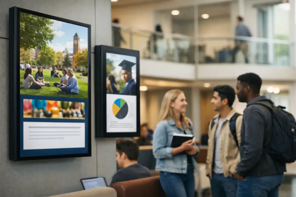
Good campus signage content starts with context. A residence hall screen has a different job than a screen in a science building lobby. One may promote events and reminders. The other may need room schedules, announcements, or wayfinding support. Treating every display the same usually leads to crowded layouts, weak engagement, and stale messaging.
The most effective approach is to define the job of each screen first, then build content around that job. Is the display meant to inform, direct, reassure, promote, or update in real time? Once that purpose is clear, content choices become easier. You know what belongs, what does not, and how long each message should stay on screen.
This is also where operations matter. Campus communications often involve many contributors across departments. If every update requires a specialized design workflow, content slows down and screens get ignored. Teams do better when they can create in familiar tools, use approved templates, and publish to one or many screens without extra production steps.
Best practices for campus display content by screen type
A common mistake is writing one content plan for the whole campus. In practice, screens should be grouped by audience and location. That gives each network a clear purpose while keeping management centralized.
High-traffic public screens
These screens live in entrances, student centers, dining halls, and other busy spaces. Messages should be short, visual, and easy to absorb at a glance. Event promos, safety reminders, directional content, campus-wide announcements, and simple countdowns tend to perform well here.
Dense text does not. If someone needs to stop and read for 20 seconds, the content belongs somewhere else. Keep each slide focused on one message, with a clear headline and a strong visual hierarchy. In most cases, the headline should do the real work. Supporting text is there to clarify, not to carry the whole message.
Academic building screens
These screens often support a more practical use case. Class reminders, department news, office hours, speaker series, lab notices, and room information are more relevant than broad promotional content. The audience may be more patient here, but clarity still matters.
This is a good place for structured layouts. Department-branded templates, recurring announcement zones, and predictable content rotations make these screens easier to maintain. If live room or schedule data is available, automated updates can reduce manual work and improve accuracy.
Administrative and staff-facing screens
Internal campus screens have a different rhythm. They can handle operational content such as HR reminders, service disruptions, policy updates, internal recognition, and deadline notices. Staff audiences may tolerate slightly more detail, but the same rule applies: one screen, one priority.
For internal communications teams, the trade-off is usually between speed and consistency. Fast updates are important, especially when policy or service information changes. But without templates and approval rules, screen networks quickly become inconsistent. A simple governance model solves a lot of this.
Keep content brief, readable, and repeatable
The best campus display networks are not built on constant reinvention. They are built on reusable patterns. That means a small set of templates, a defined content rhythm, and clear rules for what each slide should include.
Start with readability. Large type, strong contrast, and limited text are non-negotiable. Campus displays are often viewed from a distance, at an angle, or while moving. If the design only works from two feet away, it is not working. A practical test is to stand back and ask whether the core message is still obvious in a few seconds.
Motion deserves restraint. Animated elements can draw attention, but too much movement makes screens harder to read and easier to ignore. The same is true for crowded slide rotations. If every message looks urgent, none of them will feel urgent.
Repeatability is just as important. Campus teams benefit from content they can update quickly using existing skills. PowerPoint-based workflows are especially useful here because they let non-technical staff create polished signage without learning design software from scratch. That reduces bottlenecks and makes it easier for departments to keep screens current.
Build a scheduling strategy, not just a playlist
A screen network becomes far more useful when scheduling is intentional. Too many campuses treat scheduling as a simple loop of slides. That works for a while, but it misses the operational value of digital signage.
Think in layers. Some content is evergreen, such as brand messaging, campus values, or recurring student resources. Some is calendar-driven, such as event promotions, move-in reminders, registration deadlines, or orientation schedules. Some is urgent and should override normal playback, such as weather alerts, safety notices, or building access changes.
When those layers are planned in advance, updates become much easier to manage. Teams can prepare seasonal content blocks, assign start and end dates, and target messages to relevant buildings or departments. That keeps the network fresh without requiring daily manual intervention.
This is where centralized management pays off. If one team can schedule content across multiple screens or locations from a single platform, consistency improves and local teams spend less time chasing updates. For campuses with stricter infrastructure requirements or real-time data needs, on-premises deployment can also make sense, especially when automated content feeds are part of the plan.
Governance matters more than most teams expect
Campus signage often starts with enthusiasm and ends with too many people posting too many different things. The issue is rarely the software. It is the lack of content standards.
A workable governance model does not need to be heavy. It just needs clear ownership. Decide who can create content, who can approve it, who controls templates, and who has publishing rights by screen group. Set basic rules for branding, font sizes, image quality, and message length. Define how long announcements stay live and when outdated content is removed.
Without those rules, the same screen may show a polished event graphic, a blurry flyer, and a paragraph copied from an email. That weakens trust in the whole network. People stop paying attention when screens feel random.
The best governance models also respect how campuses actually work. Some departments need independence. Others need central oversight. A flexible system lets central teams maintain standards while giving local users simple ways to update approved layouts.
Measure usefulness, not just activity
If a campus has a lot of screens, it is easy to mistake volume for success. More slides, more updates, and more contributors do not automatically mean better communication. What matters is whether people understand and act on what they see.
Useful measurement can be simple. Look at whether event attendance improves when screens promote it. Track whether fewer people miss deadlines after adding reminders. Ask front desk staff whether visitors find destinations more easily. Review which messages are repeatedly requested and which are ignored.
Content also needs regular review. If screens are carrying outdated events, expired deadlines, or generic filler, they lose credibility fast. A monthly audit is often enough to catch stale content, remove weak slides, and refine layouts that are not performing.
Make it easy for teams to keep screens current
The long-term success of campus signage comes down to one practical question: can ordinary staff keep it updated without friction? If the answer is no, quality drops over time. The right process should make content creation, scheduling, and deployment feel routine, not technical.
That usually means standard templates, familiar authoring tools, centralized control, and screen groups that reflect how the campus operates. It also means choosing a deployment model that fits the institution. Cloud-based management is often the easiest path for distributed teams, while on-premises environments may be better for campuses that need tighter control or automated local data updates.
SignageTube fits naturally into that kind of workflow because it allows teams to create content in PowerPoint, then schedule and manage playback across screen networks without adding unnecessary complexity. For campuses balancing speed, consistency, and limited resources, that simplicity is not a minor feature. It is what keeps the system in use.
The best campus screens do not try to say everything. They help the next person make the next decision, whether that means finding a room, showing up to an event, or noticing an update before it becomes a problem.